Wednesday, October 5, 2022

Party Planning Zine

 Here are some pages from a "Party Planning Zine" from the past. It was a cut-and-paste-then-Xerox job.


Sunday, October 2, 2022

Something Sketchy

I've been trying out a sketchbook prompting technique that artist / cartoonist Charles Burns has discussed employing in interviews and books of his work. Essentially you tape a reference image to the backside of the previous page (or inside of the front cover, initially, I guess) and then rework the picture out in your sketchbook, in your own style, incorporating your own aesthetic choices.

The following are just a few of the examples of my own exercises in this.


I have no idea what "The Snake Pit" is, or why this Famous Monsters of Filmland trading card is labelled as such. The trading card set came out in 1963, and indeed features stills of creatures and ghastly shots from established horror films, largely AIP teen monster flicks and peplum films. After you get to card 20 or so, of the 64 card set, the images are either misidentified, oddly cropped illustration from movie posters or pulp magazines, and images of contest winners done up in their contest-winning make up creations. One such is the above image. The blurb from FMOF identifying the winner is below. 


Above is country music legend Ernest Tubb. 


I'm not a sports fan in the least. I have zero interest in watching other people play games and get paid millions upon millions of dollars to do it. You might as well have regional Yahtzee players making seven figures with crowds of beer-swilling idiots crowding around them, threatening the referees after each official dice roll count. 

Vitriol aside, this is some baseball trading card featuring Kansas City A's pitcher George Brunet, who was apparently traded often throughout his career, and eventually made his way to Mexico, where he pitched for the Mexican league into his fifties. All of that info came from a cursory internet search. I chose the card because of the unibrow, dyspeptic expression and oddly elongated neck. And while I find professional sport boring, I genuinely can't stomach "professional" sports analysis, particularly when it's a bunch of self-styled oracle blowhards sitting around, pitching speculation about what a certain team needs to do to win an upcoming game. The gist of it is always "I think what (insert team name) needs to do to beat (insert team name) in tomorrow's game, is to win it!"


Monday, September 19, 2022

Print-At-Home Zine

You want a small, easy to manufacture zine you can make yourself? Great!

Here's how you do it!

Step 1: Save the 2 images below to your desktop.

Step 2: Print them back to back on one sheet of paper. That's double-sided printing, y'all!

Step 3: Fold the final printed paper into quarters. Feel free to use the handy-dandy fold lines already on the page! If you done did it correctly, all of the drawings should be right side up. 

Step 4: You're going to need a pair of scissors (get your parents' help!) to carefully cut the top two folds, so you have eight individual pages!

Step 5: Staple the pages together in the center of the crease between the 4th and 5th page!

Boom shaka laka! - You Just Zined Yourself!


Technical notes: The above images are scanned in at 300 dpi resolution. They're not going to look as spiffy as the originals, but remember, it's free! Also, the images are provided for the free zine activity only. Don't take one of these images and stick it on a t-shirt or a throw pillow or a pair of pasties without asking me first. Pretty please?! Thanks!


 ALSO: Please send me pictures of your finished zines! I'd love to see what configurations you get, putting what panels as the front, back, etcetera. I certainly had a plan when I started it, but you can get a few different permutations with this setup. Which drawing is your favorite? Why? LET ME KNOW!

Monday, September 5, 2022

Gods & Monsters 2022

I have been invited to participate in the Otherworldly Arts Collective of Minneapolis's "Gods & Monsters 2022" Halloween art show! An open invitation was placed online and after submitting digital samples of my work, I was chosen to participate. There is a two piece maximum per participating artist, due to space restrictions. The actual show is in October, and I'll post more information regarding that later. 

The two pieces I'm bringing to the show are posted below.


"Tombyard Troubadour" acrylic on gessoed cardboard.

Music plays a large part in my life, and obviously, as a result, is something I draw a lot of inspiration from. "Tombyard Troubadour" is the result of a number of colliding influences. I enjoy country, country western and "hillbilly" music from the 1920s through the early 1970s, and believe it or not, there's a lot of darkness to the genres. Aside from seasonally appropriate novelty tunes like "Tennessee Hill-billy Ghost", which has been cut by Eddie Arnold, Red Foley and others, there are a lot of suicide and murder ballads as well. I had the idea of a sort of guardian ghost musician wandering around a secluded backwoods graveyard, strumming out spooky tunes on a coffin shaped guitar. I wanted something that would fit perfectly on a bubblegum card, a bright, poppy image that would sort of tell a whole story or set the tone for a whole visual world in one image.

"Zombie Surf Punk" acrylic on paper.

I love comics, but one of the biggest missed opportunities in the comic page/panel layout, as far as I'm concerned, is how artists don't do anything with the word and thought balloons aside from plotting out how they're going to position the artwork around them. In the world of the comic cartoons, so much of the page realty is taken up by the dialogue bubbles, that you'd think at some point someone would treat them like a functional part of the reality and incorporate them into the action. That's why my risen-from-the-surf Surf Punk Zombie's speech bubble is draped with seaweed and dripping water. Our undead friend has surfaced, potentially to attend a Circle Jerks show or something, and his words have risen with him, thus they are subject to the same ocean detritus that he is. 

The Otherworldly Arts Collective can be found online at their facebook and Instagram accounts. 

Jensen Lake Trail (And Backyard)

 Below are some photos I took with my camera at Jensen Lake trail, part of the Lebanon Hills Regional Park. I went for a hike there last Wednesday. There are two pictures–the first one of a frog (or toad?) and last one, which is a Cooper's Hawk–were taken in my backyard. 


Wednesday, July 13, 2022

Haunted House


Late last night I was flipping through the August 1983 issue of Computer & Video Games magazine, a British video game enthusiast publication, and came across this great illustration for the game Haunted House. Apparently the magazine was initially aimed more at coders than your casual arcade enthusiast, as most game spotlight articles feature pictures of long blocks of code rather than any in depth look at the games themselves.

The illustration is signed Gulbis. I have no idea if this is some early work by the self-proclaimed "Football Artist" Stephen Gulbis, or not. When you Google his name a lot of early home console video game packaging comes up, none of it explicitly linked to that same Steve Gulbis. Gulbis is British, and though he touts having built a career on solely drawing soccer players and American football players for various markets, I have to imagine he'd had to diversify somewhat at some point. You wouldn't know it to look at his website, though. 

The subject matter, obviously, made the piece stick out for me, but ghosts and skeletons aside, I really like the limited cool color palette with the high contrast of the black shadows. I also really like the Dutch angle perspective, it really adds a sense of high drama to the image that a straight-on version of the image would lack. 

Tuesday, July 12, 2022

Eye On Art: Dominick Di Meo

 I first came to know about Dominick Di Meo in 2019, when I visited the Minneapolis Institute of Art's showing of work by artists associated with the Hairy Who collective from Chicago. You can see pictures from that visit here. I don't believe that Di Meo was part of the Hairy Whos, at least not formally, but rather was living in Chicago around the same time, making him more of an accomplice-in-art than a group participant. 


Whatever the case may be, when I first saw his piece Untitled (Red line with heads) (above) it smacked me square in the attention zone and held it for quite a while. The juxtaposition of the mask-like, almost skeletal faces floating around the amorphous background, and the red hot laser beam of color shooting across the otherwise gloomy canvas seemed so intriguing in the presence of all of the pop colors and very precisely dictated forms of all of the other pieces on display. 

Even if Di Meo's aim isn't to necessarily produce something aesthetically ghoulish or sinister, there's definitely a haunting, otherworldly vibe to it. Maybe it has something to do with all of those ghostly  not-quite-skulls silently moaning in three dimensions from his canvases and sculptural pieces. Of course if you do even a cursory web search on the artist, you'll be told first and foremost, repeatedly, as if it's the only thing anyone has to say about the guy, that he spent a fair amount of time during his formative years in a polio ward, which is credited as the source of his darkly askew output. 

Another common visual in his work is the collage of common household objects, usually presented in a jumble, and rarely as true representations of those items but rather as hazy absences of them; almost as if someone took an x-ray of a junk drawer and transferred the negative image to canvas.  You can see what I mean with the assemblage of scissors, bits of string and other household junk floating within the menacing amoebic form in the 1973 piece Untitled (face on yellow) below (from the Corbett vs. Dempsey website here). Are these the commingled specters of the items we consider garbage but refuse to wholly part with, confronting the viewer to let them know that they may have been confined to a darkened drawer somewhere, but that they do in fact still exist and can still serve a purpose (for if they couldn't, would they have been kept around in the first place)? Is that somehow related to the artist's interment in a polio ward as a child? No idea.


Whatever it is that drives Dominick Di Meo to produce the art that he does, I am a definite fan of the output. He eventually found his way back to New York where he continues to live and make art. Collected below are some more of my favorite Dominick Di Meo pieces.


"The Soft Torso Breathes" 1964; synthetics on canvas.

 
"Invalid With Mirror" 1973; synthetic polymer transfer on canvas.

"Untitled" c. 1970; acrylic, polymer, shaped elements, and tacks
on three canvases.

"Harlequinade" c. 1965; oil on canvas. 

Monday, July 4, 2022

Haunted Hot Rods


I was, and still am, I guess, a monster kid. I think I have shared before the story about how one fateful afternoon in the 1980s I was exposed to Tod Browning's Dracula, and my mind was suitably blown and primed to seek out monster movies, and related ephemera, from that point forward. Of course to present that as the moment I was introduced to monsters in the pop cultural sense, would be inaccurate, because I had by that point, already been toddling around in Incredible Hulk t-shirts since I was in diapers, and had had a shoe box full of Masters Of The Universe figures–a large number of which were monsters of various sorts. 

As I grew older, and my interests diversified, monsters (more so than straight "horror") stuck with me. And as I got into comic books, and later music and other things, I found these amazing overlaps in the spheres of the Venn Diagram of my hobbies. There's surf music about monsters?! There are comic books with monster stories?! I quickly grew to favor supernatural comic book characters like Deadman, Ghost Rider, Werewolf By Night and Swamp Thing, and scoured the weekly TV Guide for listings of monster and sci-fi movies on AMC (back when they were more akin to what TCM is now, than a version of early 90s HBO). Fortunately the late 80s/early 90s burgeoning basic cable market was flush with shows like Werewolf, Forever Knight and Monsters, and the Universal Monsters were back in vogue, popping up in everything from toys to Doritos packaging.  

As I pursued these various interests I found that the offerings to discover were often unilaterally declining in quality the more recently they were produced. Straight-to-video horror might have a certain outsider charm to it, but something like Galaxy of Terror or Creature didn't seem to hold a candle to Creature From The Black Lagoon or The Mad Ghoul. I don't like gore if it's the focal point of a movie/comic/novel, I don't enjoy films about groups of people, often teenagers or thirty-somethings playing teenagers, being systematically butchered in novel ways by some psychopath in a mask. I also don't have time for parodic material that doesn't respect the source. Was I whole-heartedly obsessed with The Misfits when they crossed my path? You bet! But metal that glorifies senseless brutality, not so much. 

Yadda yadda yadda. My brand of horror has always been more Hammer Films, Boris Karloff, EC Comics and Famous Monsters of Filmland than Fangoria, Rob Zombie and the hyper graphic Twisted Tales. That isn't to say there isn't a great deal of contemporary horror stuff that I greatly enjoy, but prior to the 1970s the idea seemed to be providing entertainment, not entrails. I like a bit of fun with my fear and there's lots of great stuff buried in the past if you dig for it. I've dug out a 1964 issue of Pete Millar's Drag Cartoons magazine to share today. It's a quick little hot rod monster mash produced by noted animation designer and cartoonist Alex Toth. Page 3 is a little faded but still reads just fine. Note the resemblance of the Monster in this strip to Dick Briefer's design for the creature in his Frankenstein comics (pictured below).

Cartoonist Dick Briefer had two different creature 
designs for two different iterations of his Frankenstein comics,
one humorous and cartoony, one menacing for straight horror
stories. The above is a panel from a horror-oriented 1954 issue.


 I'm not a gearhead by any measure; both of my grandfathers were career body men for various dealerships, my appreciation, however, is more or less confined to the aesthetic appeal of vintage car body design and the George Barris TV car creations, hence why I have the source material for this here post.

Enjoy.


Sunday, July 3, 2022

Eye On Art: Alexander Archipenko

 He was born in Kyiv, Ukraine in 1887, but his pursuit of art took him to Moscow, Paris, and eventually New York, where he was interred in Woodlawn Cemetery, in the Bronx, when he passed in 1964. Archipenko is credited as having been the first to apply Cubist principles to architecture and the creator of "sculpto-paintings", which are pieces that combine 2-D painted art with 3-D sculptural components on a canvas. 

"Médrano II" 1913-14. Painted tin,
wood, glass and painted oil cloth.


My introduction to Archipenko was entirely incidental. I had biked over to my local library and was looking at a book on Cubism, hoping to find some spark of inspiration that might ignite the pilot light of my imagination and result in a sketchbookin' session. I don't recall the exact title of the book, or its author–not that it's entirely important here–but on a page amongst some quarter-page reproductions of Fernand Léger's and a couple of Braques, was this tiny black and white picture of an Archipenko sculpture. It was this tiny, Post-It note-sized reproduction of Médrano II (1913). It stuck out like a neon sign. As much as I adore Léger's cartoonish pop color compositions, and Braque's broken-mirror-reflection building scapes, this tiny little insert photo was able to draw my eye away from the featured stars and put a bug of determination in my brain that buzzed to know more about this artist and his work.

"Femme assise" 1920. Gouache on paper.

"Femme Marchante" 1912. Sculpture in bronze.

There's a certain dynamism in Archipenko's pieces that vibrates with an aesthetic resonance in tune with those to whom Mid-Century abstraction appeals. Archipenko's work not only encapsulates everything that I find appealing about Cubism, both in form and principle, but also, as stationary, inanimate objects, his sculptures seem to resonate with a frenetic energy that other Cubist sculptors like Joseph Csaky and Jacques Lipchitz don't. I'm not disparaging either of those artists, Lipchitz's series of angular figures Le Guitariste (1918), Pierrot (1919), Harlequin With Clarinet (1919-20) and Man With Guitar (1920) would be tempting purchases if money were not an issue; but speaking subjectively, it's the negative space that Archipenko incorporates into his forms that create a sense of movement. He commented on this practice by saying:

"Traditionally there was a belief that sculpture begins where material touches space. Thus space was understood as a kind of frame around the mass... Ignoring this tradition, I experimented using the reverse idea, and concluded that sculpture may begin where space is encircled by the material." 


"In The Boudoir" 1915. Oil, graphite, photograph,
metal and wood on panel.


"Der Tanz" 1912. Sculpture in plaster.

"Carrousel Pierrot" 1913. Painted plaster.

"Venus" 1954.

"Red" 1957.

"Torso In Space" 1952-53. Lithograph, screenprint and embossing on paper.

Obviously this is just a taste of Archipenko's prolific output. Some of the pictures above were gleaned from Archipenko.org, which is an amazing resource that breaks down his life by decade and allows one to really see how his process changes, how his work progresses. It's definitely recommended to dip your toe into, even if you just want more eye candy.


Wednesday, June 29, 2022

Well I'll Be Sammed

Benny

About a month-and-a-half ago, around a week before my 41st birthday, we found ourselves saying goodbye to the second of our two dogs. My little Benny was ADR, as they say in the veterinary industry, and, sadly, it was his time. It may have hit extra hard due to the fact that his brother, Moss, left us just six months prior. Seeking a diversion the day after we had to cease our journey with Benny, the wife and I wrapped up our yard work and decided to find some spot of local interest to take our mind off of things for a while. 


I don't recall how I'd heard about Hot Sam's Antiques and Foto Park, probably some wide net Google search for local activities at some point, but I pitched the idea of driving over to Lakeville to check it out and we did. 

The "Antiques" portion of the business isn't so much a draw. Most of small town America from the Catskills to San Ysidro has a string of brownstones in their downtown district that have been converted into thrift stores or overpriced junk drawers, that have more to offer than the mildewy office/antique store at Hot Sam's, which more resembles a residential property that had to be hastily evacuated than a Goodwill. But that's not where the real business is anyways. It's the "Foto Park", where you'll find the proprietor buzzing around in his golf cart, chatting visitors up and making sure they pay the cover charge. The cost varies based on intent. If you're a yokel like me, walking around and looking at the sculptures and maybe snapping some cell phone pictures, the cover's an easy $5. If you have a fancy camera and are planning on taking some prom photos or something, then the cost per person goes up.


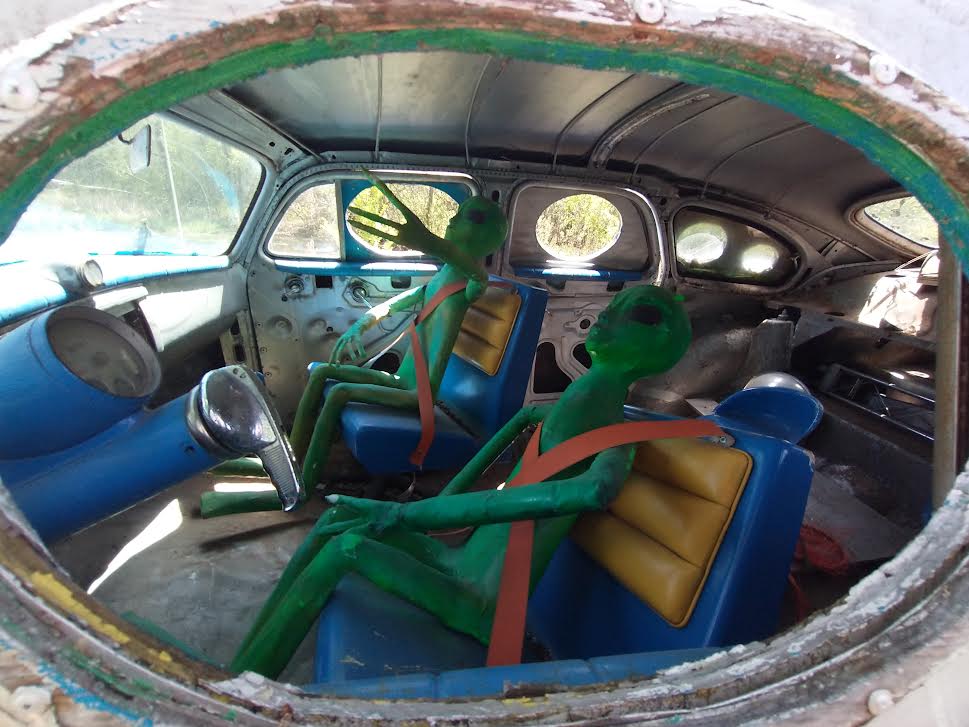
The sculpture yard is definitely interesting; there's a lot of creativity and craftsmanship in some of the pieces. There are some other artifacts that seem dilapidated, like the rotting boat fragment that reads "S. S. Minnow" on the backside, but overall all of the actual sculptures are pretty great. You'll find plenty of dinosaurs, extraterrestrials, lizard men and robots, as well as several nods to pop culture from the early-to-mid 20th century, like Betty Boop, the Adam West Batman television show, Snoopy, Tweetie Bird, even a Gumby and Pokey (of which there's a picture of me posing with, somewhere). 


If you're looking for something to do in the South Metro, Twin Cities area, and the weather permits outdoor activity, I would have to say I recommend a stop. Whether you're looking for a hit of nostalgia or just want to take in some outsider art, it's a good place to visit. The business's website is here.